First indications reveal which colours will immerse our homes in a new light in the near future. With accents ranging from watermelon through flamingo and golden yellow through sand, the coming season promises warm, vibrantly coloured impressions.
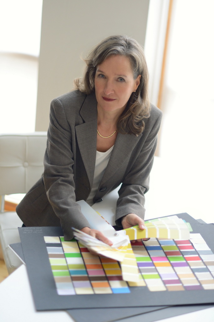
Anyone looking for the next trend colour already has it wrong, because no colour ever stands alone. It always exists within the context of other colours (new and pre-existing) and materials. This year at imm cologne, the first interiors show of the year, visitors are most likely to encounter a shift in the range of dark tones: among other changes, colour expert Dr. Hildegard Kalthegener expects to see a decline in the importance of coffee brown, a colour that has been overused in the process of McDonaldisation. The resulting open space will be filled by other colours that permit new, unexpected combinations.
The colour consultant primarily assesses which colour shades will remain relevant. Because blue, already in frequent use, is a cooler colour, it combines well with warm wood tones. “Warm-toned wood has always been important in the furniture world, and it will stay that way. But the ’coffee wave’ of recent years has run through every possible shade of brown from cappuccino to latte macchiato, which includes all colours between chocolate and coffee. We can expect a clear shift here“.
In order to provide spaces with depth and furniture with expression, warm brown, which has been dominant for so long, will gradually be replaced by darker and cooler blue tones and by dark grey, which will continue to be well represented in nuances from slate through graphite and asphalt through concrete. Another option for an expressive background is black, which was already going strong as a trend colour last year. Dark green may establish itself as a new hue that, from pine through greenish black, brings a warmer alternative into play and opens the door for entirely new colour harmonies.

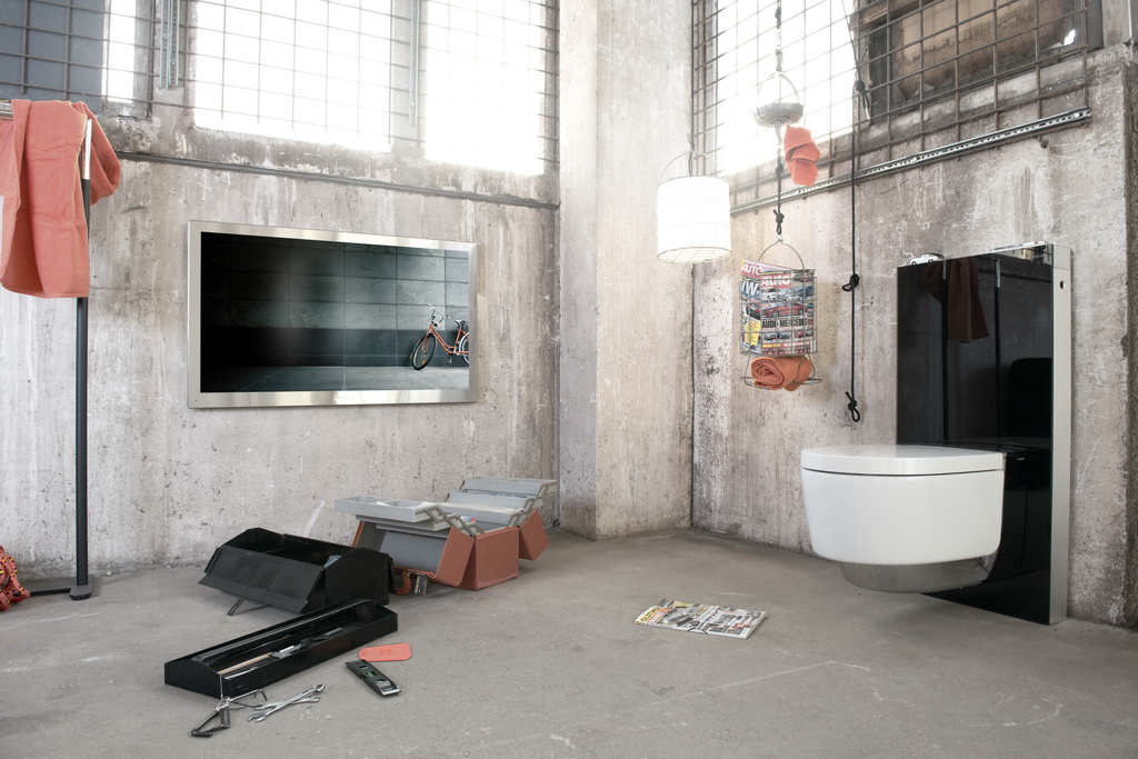
Another fitting colour combination, particularly on-trend this season in a gloss-matt contrast, is black and white – here presented in the form of the Mera shower toilet by Geberit. This colour combination has an ennobling effect on any interior and can support even harsher colour contrasts of orange-red.
An ambience of harmonious colours requires an even balance between bright and chromatic, warm and cold, neutral nuances and accent hues. “The dark colours that will continue to be used over large surfaces need brightening contrasts“, says Dr. Kalthegener. “We’ve already had yellowish green colours like lime and lemongrass in our homes for ten years now. These colours were often combined with tones from the red spectrum, like fuchsia. Now they seem too commercial, especially to very discerning consumers. These tones and colour combinations are currently moving more towards yellow, which is the perfect contrast to dark grey“.

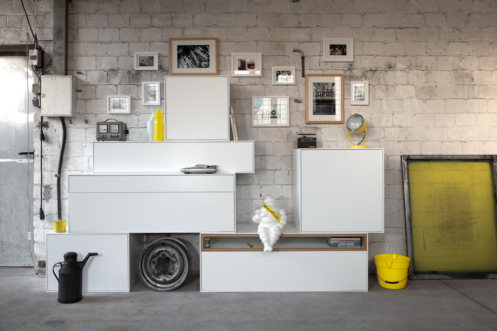
Also the already almost omnipresent white – being staged here with the new now! Easy furniture programme from Hülsta – can, in combination with grey tones varying from concrete to graphite, and currently trending accent colours from the yellow spectrum, take on a new, somewhat washed-out touch.
But not all yellows are alike. The yellow palette of the coming season ranges from a bright interpretation of ochre – a warm, sunny sand yellow that is expected to become very popular – to bold lemon and limelight. Like many of her colleagues, Kalthegener sees particularly great potential in the nuances of ochre and gold. This potential is reflected in the rediscovery of brass as a trend material: it is already appearing here and there as an alternative to copper, which has virtually overrun the furniture world in the past three years and will remain relevant in the form of a rusty colour variant. Accordingly, at imm cologne, both metals and metal tones will likely be on show at the same time.
The current sand yellow makes clear how strongly the impact of colours is influenced by the tones and materials that accompany them. Set against black, sand yellow appears almost pastel; against white, it seems vibrant and bold. On a sheet of white paper, the sunny ochre has a strong impact, whilst it has a delicate, organically brightening effect on oak furniture. Although ochre is a rather traditional colour – one of the oldest pigments to be used in human history – it is also well-suited to modern living environments and can be used to provide accents or to cover large surfaces.
As another contrasting colour to the dark spectrum consisting of black, dark grey dark blue and dark green, vivid blues remain current. In addition to teal, which is already in relatively wide use, bright variants from aqua-mint to Caribbean turquoise are appearing with increasing frequency. They harmonise perfectly with pine or dark grey, even in combination with bold yellow accents .

An eye-catcher in sunny yellow: the Divanitas armchair (Verzelloni). As one of the strongest colour trends in interior design, yellow makes a perfect contrast to dark grey-tones and is complemented well by a fresh aqua hue as a second on-trend accent colour (LO12 side table by Müller Möbelfabrikation).
The third contrasting colour of the current trend imposes a shift of emphasis on the colour spectrum: the colour expert sees a clear shift in the red colour spectrum from fuchsia and violet hues towards a restrained orange-red. The nuances appearing here fall “somewhere between red and copper“, says Dr. Kalthegener, “and are reminiscent of raspberries, sliced watermelons – or, in a somewhat softer variant, of flamingos“.
Watermelon is particularly suited as a good companion to dark green, but also to colours that are already well established, like dark blue or teal. New contrast colours like these – the use of which does, however, require some courage – could also catch on quickly as colours for accessories to furniture and furnishing concepts already in place.
Whilst one contrast colour – watermelon – has evolved out of the copper material trend, sand yellow is bringing a new material – namely brass – with it into hotel lobbies and living rooms.
The colour expert recommends colour schemes which pair a dark shade (dark blue, dark grey, dark green) with one or two contrast colours from the current yellow or blue spectrum (such as sand yellow, lemon and/or aqua-mint) or with the contrast colours sand yellow and watermelon. She sees the pairing of pine and watermelon with bleached blonde oak as a bold, but very beautiful colour combination . On the other hand, a combination of all three of the current contrast colours – limelight, aqua-mint and watermelon – can quickly become gaudy and busy.

Beautiful colour combinations from the current five colours palette are dark background colours such as grey and black-green paired with accents in watermelon; furniture in warm and light oak go well with this – an example of which is the Sol desk from Team 7.
Dr. Kalthegener emphasises that the most important question is not which colour is now the dominant one. They all have their own time and place. It is more relevant to consider which shade will be suitable in the long term for a home and, most importantly, with which environment, interior, and target audience it is the best fit. For the manufacturers, the choice of colour within each product category is significant. When developing a new sofa, only the most daring brands will opt for an accent colour as vibrant as watermelon. A lighting fixture, pillow or contrast stitching is much more likely to be featured by design-savvy exhibitors at imm cologne.

Dr. Hildegard Kalthegener
The only remaining question is that of wood trends. Oak would actually suit the dark shades perfectly, but it has already been the standard type of wood for years. If white has already lost its position as the dominant achromatic tone to black and combinations of black and white, should parquet-layers and fans of solid wood expect oak to be downgraded as well?
There is an “all-clear“ in this respect: oak will remain as a wood colour at the middle of the spectrum, frequently also appearing in bleached tones. That is precisely what is sought after as an alternative to wood in very dark, coffee-brown shades as well as to the lightness of Scandinavian blonde wood: wood of medium brightness, in colours that fall somewhere between honey and cognac. Wood of this kind pairs well with the new sandy hues and vibrant, eye-catching colours in particular, though also with dark background colours.
Yet another tip from the colour consultant: the five current colours for interiors (pine, sand, aqua, lemon and watermelon) should not be mixed at random, as though on a palette; their use should be deliberate and carefully proportioned. It is necessary to decide between turquoise/aqua and watermelon as an accent colour. This allows for atmospheric colour arrangements with long-lasting appeal.
After all: who would see a combination of pine-needle green with nuances of sunny sand and aqua and not think immediately of the Caribbean or a walk down to the beach?
Photo: Franks Garage; Koelnmesse
