Discover color pairs that complement and emphasize one another.
The complementary color scheme consists of two colors that are situated opposite each other on the color wheel – red and green, blue and orange, yellow, and purple. These complementary color pairs are in natural harmony and thus these paired hues complement and emphasize one another. That is why it is said that the opposites attract in the complementary color scheme. For example, by joining yellow and purple, both hues become more intense, orange floor tiles highlight the blue walls and the red vase looks more energetic on the green tablecloth than on a tablecloth in any other color.

Photo: JAB Anstoetz
Colors of Love That Attract Each Other
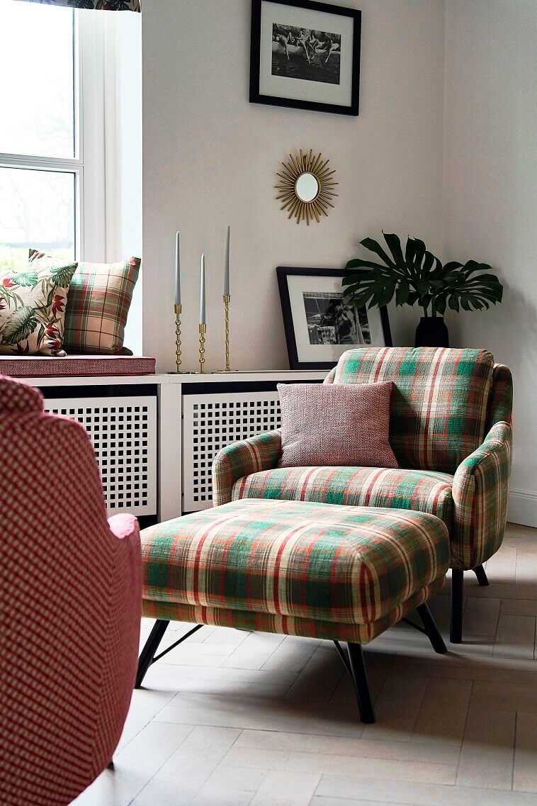
Red and green are the known colors of love that attract each other. Red is the primary color whose complement is the color green – the secondary color created by merging the remaining two primary hues – yellow and blue. In this way, the cool green brings warm red into balance – by combining it with the other two primary colors of the color spectrum.

Photo: JAB Anstoetz
Red communicates passion and warmth and is the strongest of all colors. This stimulating hue also enhances creativity. Green represents Nature and relaxation. This harmonious and calming color is a real sight for sore eyes.

Photo: Osborne & Little
Complementary Color Pairs – Designing Creative and Optimistic Interiors
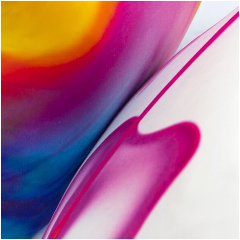
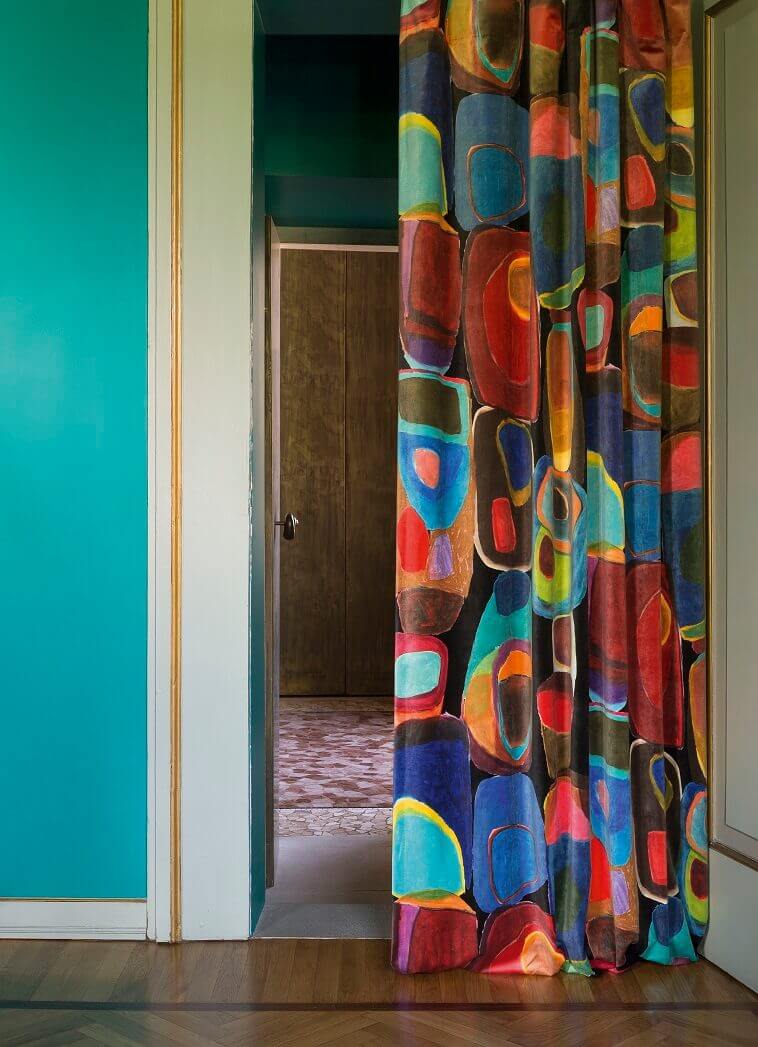
In the company of complementary purple, the secondary color created by combining the primary colors red and blue, all the sunny power of the primary color yellow is emphasized. When these complementary hues come together, a true energetic duo is created, most suitable for designing interiors in which creative activities are being conceived.

Photo: Elizabeth James Art
Optimistic yellow is the color of the mind that improves learning and creating. Classy purple is the color of nobility that also stimulates the center of creativity.

Photo: JAB Anstoetz
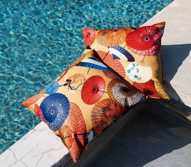
By combining the primary colors red and yellow, the secondary color is created – orange, which, as a complement of the primary color blue, highlights this hue of the Mediterranean.

Photo: JAB Anstoetz
Blue creates a calming and relaxing space and is certainly one of the most popular colors. Orange symbolizes warmth and comfort and is also known as the color of vitality.

Photo: Missoni Home
The complementary color scheme is very active since the “opposites attract” in it. Therefore, it is a great choice for designing energetic and artistic home interior spaces.
Cover Photo: JAB Anstoetz
For more creative design inspiration, you are welcome to follow Danica Maricic on social media and subscribe to her YouTube channel.
Green Color Combinations for Home Office – Find Out More
Yellow Color Optimism in Design – Discover More
Colorful Design & Travel Inspiration – Read On
