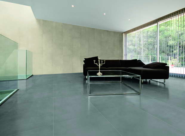
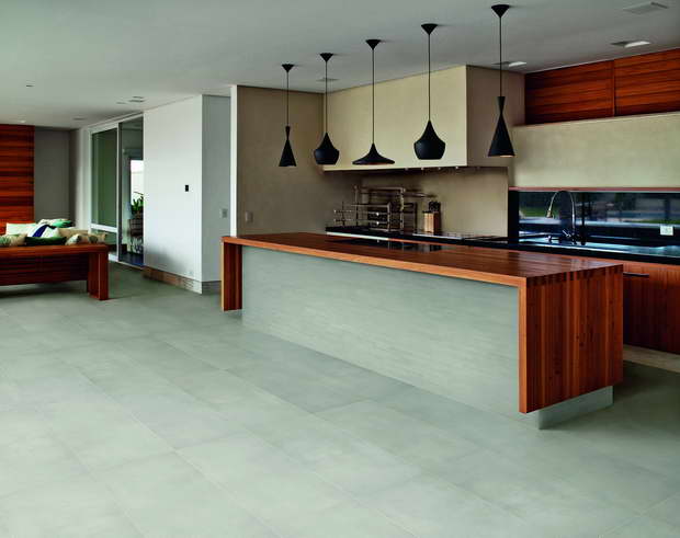
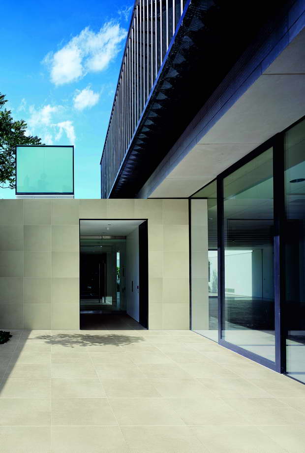
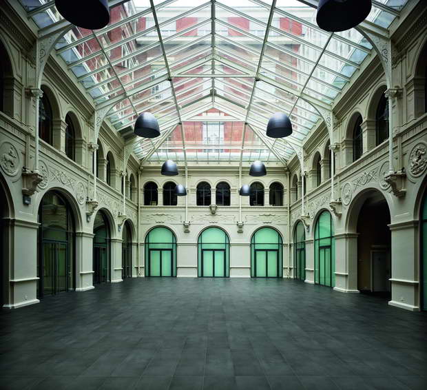
With Greigetone Eiffelgres introduces the first collection of Mauro Bellei’s Tone Program: a program encompassing a number of collections, each of which includes different colours, the result of advanced research and technology. In the daily vocabulary, “tone” refers to a state of wellbeing but also to the gauging of the sound or voice modulation; in fact there is a substantial difference between an affectionate tone and a threatening one!
In painting, actually, tone refers to the brightness of a colour, something you can easily note by observing the contrast between a matt colour and a glossy one, or between a bright colour and a dull one.
Finally there are in-between tones, and these are the ones the Greigetone collection is concerned with.

The pronunciation of the word Greigetone intuitively suggests greige and stone: a stone of a particular tone. Greigetone originates in Eiffelgres’ want to add a new version of limestone to its catalogue. The result was given concrete form following analysis of an ordinary piece of cardboard: one of those you can found after the last page in a drawing pad. At a summary glance, this piece of cardboard looks like the surface of fine limestone; it also recalls to micro-concrete. With particular light reflections it looks perfectly flat, while with others one it reveals its structure (a feature which encourages investigation of the relationship between surface and light which begun with the Sensible collection already part of the Eiffelgres catalogue). Changing the colour of the cardboard, we may imagine other materials, such as the patina on rusted metal or the skin of old pieces of driftwoods, ordinary plasters or strong felts.

Along with these considerations, we came up with the idea of developing a link between art and architecture through the study of colours, not only to form a bond with history but also to set up and establish roots for a process guaranteeing future continuity. Greigetone seems to create a link between the purist Le Corbusier, and Giorgio Morandi who expresses his thought through his unmistakeable tonal moderation: two key figures of the twentieth century who appears very different from each other, but it seems they shake hands and agree on this particular tones concept. This approach can be confirmed by observing some of Giorgio Morandi’s paintings and some of the colours recommended by Le Corbusier, faithfully reproduced in the Le Corbusier Polychromie architecturale collection (Arthur Rüegg, Birkhauser, Zurich, 2006), a collection first printed in 1931. (Mauro Bellei, 10 maggio 2012)

